Inspired By | Modern Farmhouse Laundry Room

Farmhouse Style Laundry & Mudroom Inspiration

I am so close to completing my laundry/mudroom makeover I can almost taste it! We enter and exit primarily through the back of our home and needed a design update to flow with the rest of our home (which you can see here if you want!).

For those of you who are new around here - we live in a farmhouse built in the 40s with a major addition put on in the mid sixties. In true farmhouse style, rooms have been added on or spaces made larger and I suspect our laundry/mudroom used to be a porch of some sort before it was finished. 

When I started planning for making over this home, my catchall was "Midcentury Modern Farmhouse" (Here's my huge Pinterest board of the same name) And when I say farmhouse, I mean more of the bones of the space and less in the way of decor (probably no chicken wire in my future!) I've also found myself really doing a lot with bohemian style too - lots of wooden vessels, baskets and houseplants. So for this laundry space, I wanted to set the tone for the whole house and pull together everything I love!

These photos are a great example of what I've been inspired by!

1. Shiplap | Thanks to Jo Jo and Fixer Upper, shiplap has become a popular texture and makes perfect sense for a farm style entry room. I can't wait to show you what my dad and I installed! I have become pretty decent at the miter saw and at swinging a hammer too! And I felt like a boss at the lumber yard loading up my pallet and picking the best wood. 

2. Open Wooden Shelves |  In our last home we did open shelving in our kitchen remodel and I loved it. Adam has a technique for making the boards super smooth and for laundry organization it just makes perfect sense to have your cleaning supplies right by the machines. For this house we've been able to upcycle all of our open shelves and that fits in really nicely into my Make, Do & Mend mission. More on that when I show the final space! 

3. Plants! | This is kind of an aside, but I feel that my seasonal depression has been mitigated by how many houseplants I have hanging out with me (now up to over 20 #plantgang!) My laundry space has two huge 70" windows so there's a lot of opportunity for growing! 

4. Bright White | Nothing say so clean and so fresh (Cue Outkast) like bright white walls in a laundry space. I used to feel like white walls screamed RENTAL! but after years of doing so much color I really like them. And white black and wooden accents they just look so pretty. 

So that's kind of a hint to how the space will come together. I am 85% complete right now and just waiting on a delivery to finish up and then photograph (and a nice sunny day!) Guys - I'm pumped! I've found a lot of joy in my home projects and can't wait to share! 

Our Farmhouse | Dining Room Makeover

MCM farmhouse dining room 1.JPG

Guys! I am so excited to share with you our latest finished project - the dining room! When I stepped foot in this house I saw so much potential and I think the completed dining space is a testament to that! While we normally tackle all of our reno work alone, this project included new hardwood floors (they're ash!) and a custom iron railing. The rest of the work - all us! And by us I mean me, Adam, my father in law Jim and my dad! Plus both grandmas who helped watch the kids while we worked over the course of many weekends. It's not like what you see on TV! This stuff takes weeks (or in our case, months!)

Come on over and let me tell you about it!

Before

before 1.jpg

This space is part of a 1965 addition the original owners designed for the house. Standing at this vantage point is what sold the house for me (really, I knew the moment I walked in that we were meant to live here. Read more about how we lost out on it at first and then how it all came to be here).

Fun fact: we're the third owners of the home and before us, it was all in one family! In fact, our next door neighbor was raised in this house! 

Adam and I love both farmhouse elements and midcentury style, so the blend of the two inspired this room.

Take a look at the carpet, wall texture and color, railings, steps, flower box and window awning - they're all about to change below!


After

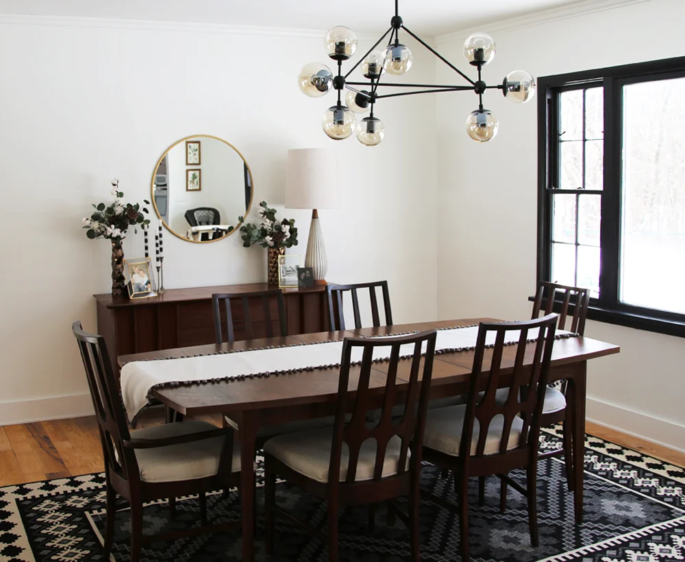
MCM Dining Room in Farmhouse.jpg
Rug and Floors

Floors

When we moved in the dining room was carpeted. We knew we'd want to change that (hello sticky, messy kiddos!) but had other more pressing budget issues to take care of first. One night while looking around at lumber on craigslist, we found a local supplier who wanted to clear out his stock of mixed width ash. The price was incredible so we bought everything we could and we hired out the installation. Instead of staining it, we had a couple coats of oil and a top wax coat applied. We also had our back hallway and kitchen done in the same wood and plan to refinish the original hardwoods from the front living room in a similar fashion.

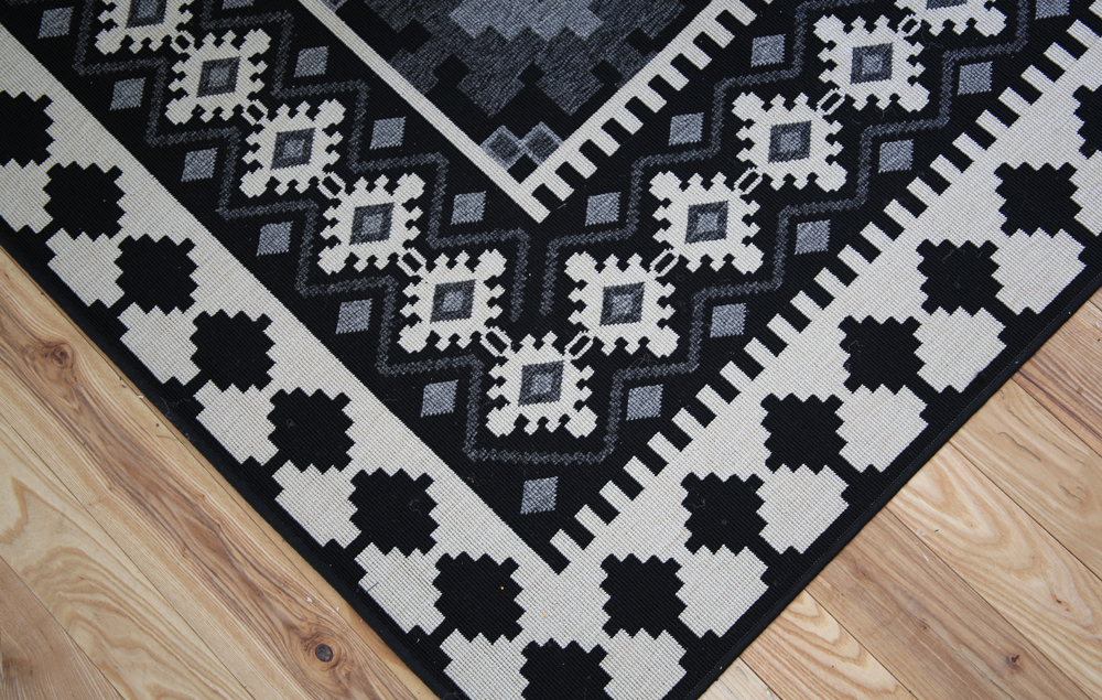
On top of the wood, I found this awesome black, grey and off white rug from AllModern (in the 8x11 size). It's indoor/outdoor (which I've found are awesome for cleaning and kids!) It sweeps up so easily but hides crumbs pretty well too. A win win! It's definitely one of the most bold elements in the room and I looooove it.

MCM farmhouse hybrid dining room.JPG

Furniture

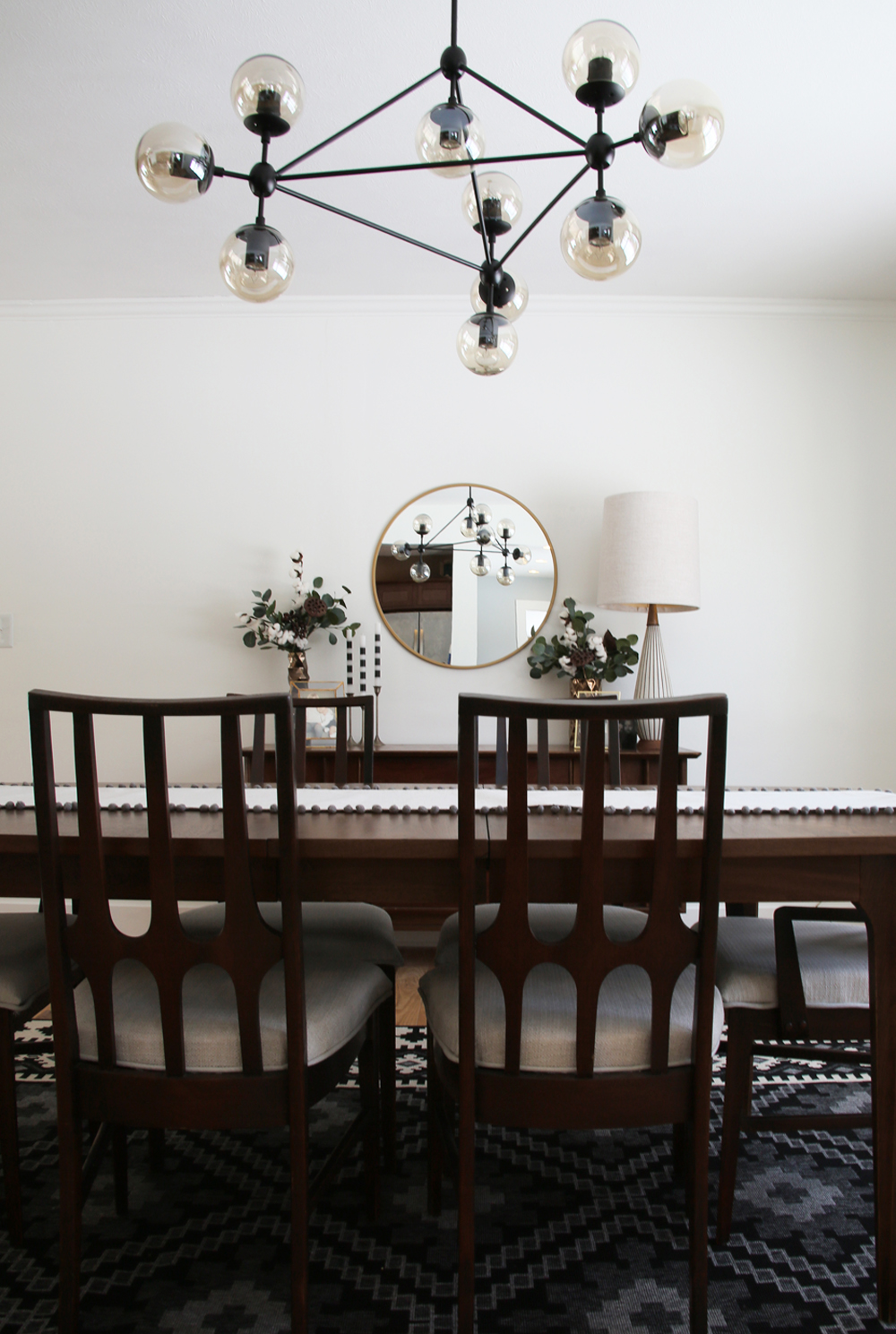
I told Adam before we did this space I was going to try to do it all second hand or homemade (and that was before I decided to make that my mission for the whole year).  The side credenza came with us from our last home (in fact, we bought it when we first moved in together in Park Slope, Brooklyn!). The table - 'Brazilia' by Broyhill was a craigslist find. I reupholstered the chairs myself (not well enough to make a tutorial, sorry!) they've been scotch guarded and already clean up well. 

10 light chandelier

Lighting

The star of the room may be the 10 light chandelier, but getting it was not easy. The first one I ordered came broken and the replacement was backordered until March. The company told us to donate or trash the broken one, so we decided to try to fix it (failed) but put it up anyways while we waited for a few months. Long story short the new one came earlier than expected, but with globes broken so between the two we finally have one light fixture. The quality is not amazing, but it looks good hanging up. I wasn't willing to pony up the thousands of dollars for the original designer version. Whatever! LET THERE BE LIGHT! 

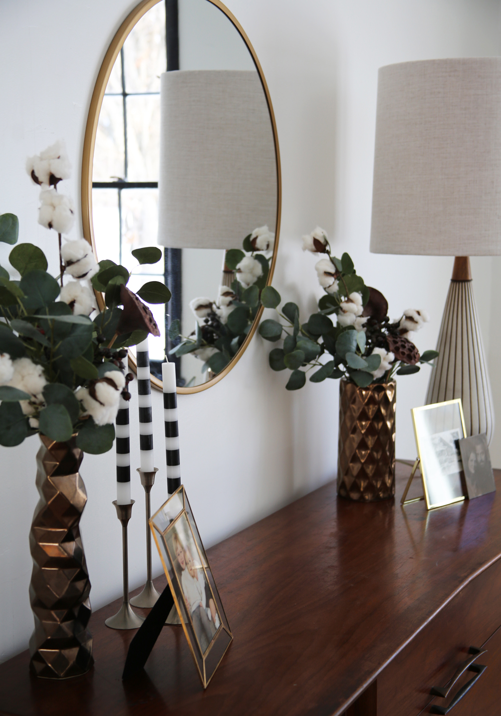
The lamp on the credenza was a vintage find and I recovered the shade myself. 

Walls and Windows

This space originally had paneling on the lower half of the wall. On the south side, we tore it out and installed new drywall (#neveragain) and on the west wall I used joint compound to fill in the grooves for a smooth finish. I googled numerous tutorials and watched YouTube clips and it's pretty straight forward! 

Next I painted the ceilings (basic white ceiling paint out of the can) and then the walls in Chantilly Lace (Benjamin Moore). I also painted the window trim and went bold by going with Black (also Benjamin Moore). I love the contrast and how it gives the room sort of a Scandinavian vibe!

railings.jpg

Railings

The old railings had more of a 1960s front porch feel than we wanted, so we took them out ourselves and had our pal Josh at Clutch Fabrications design new custom rails for us. So fresh! So clean! We also opted to change the edge from a double curve to one curve (where houseplants now live) and a straight edge. This was more economical for the metal work and also gave us an extra two feet of usable space in our dining room. 

Decor

Prints.jpg

Look familiar?! That's because I borrowed it from the upper living room. One of the things I like to do with decorating my house is to move things around from time to time. A lamp in the bedroom today might be in the living room tomorrow. Since we're not getting a lot of living done in the living room, I felt great about giving these piece a place to shine!

I did buy new frames back in 2017 from Target (available here and here). The candlestick holders are from Goodwill and the mirror is also from Target. On the table I made a quick runner using the same fabric as the lampshade and trimmed it with French grey pompom trim. 

Near the room's light switches I hung two botanical prints - a paw paw and a poplar. We have both on our property which is kind of cool! I found them at a garage sale many years ago! 

MCM credenza styling.jpg
MCM farmhouse dining room 2.jpg

See the rest of my Farmhouse Makeover posts here!